

I had to make an image slider for a project and I found out that there is no ready to use cool, basic, image slider. So I went ahead and made one using react-slick. In this article, we will be making that image slider together. Let's get right into it.
Live Link: https://7etlk.csb.app/
Github Repo: https://github.com/holdmypotion/react-3d-image-slider
Attention!
Vlad Tansky implemented a version similar to this image slider using a well maintained JavaScript library Swiper JS. I definitely recommend this repository https://github.com/vltansky/react-3d-image-slider
Setup
Run the following commands to set up the project.
npx create-react-app react-3d-image-slider
cd react-3d-image-slider
npm install react-slick slick-carousel
Now, in the App.css file erase everything and copy-paste the code below
/* App.css */

@import "slick-carousel/slick/slick.css";
@import "slick-carousel/slick/slick-theme.css";

.App {
  text-align: center;
  height: 100vh;
}

.container {
  padding: 2.5rem 0;
}
The imports are needed for react-slick to work.
Creating the Slider
Let me first throw in the required CSS for the image slider component
/* src/components/ImageSlider.css */

.slide {
  transform: scale(0.7);
  transition: transform 300ms;
  opacity: 0.5;
}

.slideWrapper {
  display: flex;
  justify-content: center;
}

.prevArrow {
  position: absolute;
  top: 40%;
  left: 60px;
  z-index: 100;
  cursor: pointer;
  font-size: 2rem;
}

.nextArrow {
  position: absolute;
  top: 40%;
  right: 60px;
  z-index: 100;
  cursor: pointer;
  font-size: 2rem;
}
And here is the ImageSlider component.
// src/components/ImageSlider.js

import React, { useState } from "react";
// 1.
import Slider from "react-slick";
import { BsChevronLeft, BsChevronRight } from "react-icons/bs";

import "./ImageSlider.css";

// 2.
const NextArrow = ({ onClick }) => {
  return (
    <div className='nextArrow' onClick={onClick}>
      <BsChevronRight />
    </div>
  );
};

const PrevArrow = ({ onClick }) => {
  return (
    <div className='prevArrow' onClick={onClick}>
      <BsChevronLeft />
    </div>
  );
};

const ImageSlider = ({ images, slidesToShow = 3 }) => {
	// 3.
  const [imageIndex, setImageIndex] = useState(0);

	// 4.
  const settings = {
    centerMode: true,
    infinite: true,
    dots: false,
    speed: 300,
    slidesToShow: slidesToShow,
    centerPadding: "0",
    swipeToSlide: true,
    focusOnSelect: true,
    nextArrow: <NextArrow onClick />,
    prevArrow: <PrevArrow onClick />,
    beforeChange: (current, next) => setImageIndex(next),
    responsive: [
      {
        breakpoint: 1490,
        settings: {
          slidesToShow: 3,
          slidesToScroll: 1,
        },
      },
      {
        breakpoint: 820,
        settings: {
          slidesToShow: 1,
          slidesToScroll: 1,
        },
      },
    ],
  };

	// 5.
  const templateImages = images.map((image, idx) => {
    return (
      <div
        className={idx === imageIndex ? "activeSlide" : "slide"}
        key={image.id}
      >
        <div className="slideWrapper">
          {image.code ? image.code : <img src={image.src} alt={image.alt} />}
        </div>
      </div>
    );
  });

  return <Slider {...settings}>{templateImages}</Slider>;
};

export default ImageSlider;
Let's break down this file
- import Slider from "react-slick"
- NextArrow and PrevArrow are the custom components that we will be using instead of the default arrows for the image slider
- In the Slider component, each element is given an index starting from 0. This is the same way Indices work in the map() function in JavaScript. We are using the state "imageIndex" to keep the track of the latest (center image in case of odd number of sliders, i.e. 3, 5, …)
- const settings hold the configuration for the slider.
- templateImages variable holds the JSX for all the image components
Usage
This code for the slider takes in the data in a format as shown below
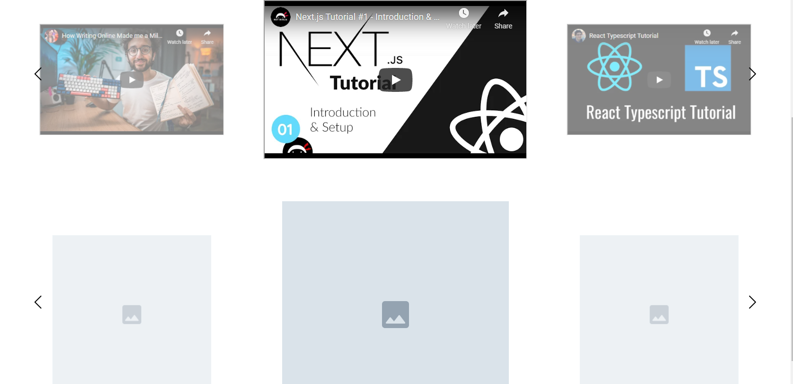
// src/data/data.js

export const IMAGES = [
  {
    id: 1,
    src: "/images/image.png",
    alt: "Placeholder image",
  },
  {
    id: 2,
    src: "/images/image.png",
    alt: "Placeholder image",
  },
  {
    id: 3,
    src: "/images/image.png",
    alt: "Placeholder image",
  },
  {
    id: 4,
    src: "/images/image.png",
    alt: "Placeholder image",
  },
  {
    id: 5,
    src: "/images/image.png",
    alt: "Placeholder image",
  },
  {
    id: 6,
    src: "/images/image.png",
    alt: "Placeholder image",
  },
];

export const LARGE_IMAGES = [
  {
    id: 1,
    src: "/images/large_image.png",
    alt: "Placeholder image",
  },
  {
    id: 2,
    src: "/images/large_image.png",
    alt: "Placeholder image",
  },
  {
    id: 3,
    src: "/images/large_image.png",
    alt: "Placeholder image",
  },
  {
    id: 4,
    src: "/images/large_image.png",
    alt: "Placeholder image",
  },
  {
    id: 5,
    src: "/images/large_image.png",
    alt: "Placeholder image",
  },
  {
    id: 6,
    src: "/images/large_image.png",
    alt: "Placeholder image",
  },
];

export const VIDEOS = [
  {
    id: 1,
    code: (
      <iframe
        title="vid1"
        width="560"
        height="315"
        src="https://www.youtube.com/embed/A63UxsQsEbU"
        allow="accelerometer; autoplay; clipboard-write; encrypted-media; gyroscope; picture-in-picture"
      ></iframe>
    ),
  },
  {
    id: 2,
    code: (
      <iframe
        title="vid2"
        width="560"
        height="315"
        src="https://www.youtube.com/embed/Z5iWr6Srsj8"
        allow="accelerometer; autoplay; clipboard-write; encrypted-media; gyroscope; picture-in-picture"
      ></iframe>
    ),
  },
  {
    id: 3,
    code: (
      <iframe
        title="vid3"
        width="560"
        height="315"
        src="https://www.youtube.com/embed/WRkmpqTluI8"
        allow="accelerometer; autoplay; clipboard-write; encrypted-media; gyroscope; picture-in-picture"
      ></iframe>
    ),
  },
  {
    id: 4,
    code: (
      <iframe
        title="vid4"
        width="560"
        height="315"
        src="https://www.youtube.com/embed/vyVpRiqOvt4"
        allow="accelerometer; autoplay; clipboard-write; encrypted-media; gyroscope; picture-in-picture"
      ></iframe>
    ),
  },
];
But, you can modify it in any way. If you just have a list of image URLs, good enough. Just change the JSX code inside the "templateSlider" variable, accordingly!
BTW, if you are wondering that why I am referencing the images in the src attribute as
export const LARGE_IMAGES = [
  {
    id: 1,
    src: "/images/large_image.png",
    alt: "Placeholder image",
  },
]
It is because the images are placed in the public directory.
public/images/......
Using the Image Slider
// App.js

import "./App.css";
import ImageSlider from "./components/ImageSlider";

import { IMAGES, VIDEOS, LARGE_IMAGES } from "./data/data";

function App() {
  return (
    <div className='App'>
      <div className='container'>
        <ImageSlider images={IMAGES} slidesToShow={5} />
      </div>
      <div className='container'>
        <ImageSlider images={VIDEOS} />
      </div>
      <div className='container'>
        <ImageSlider images={LARGE_IMAGES} />
      </div>
    </div>
  );
}

export default App;
Live Link: https://7etlk.csb.app/
Github Repo: https://github.com/holdmypotion/react-3d-image-slider
Attention!
Vlad Tansky implemented a version similar to this image slider using a well maintained JavaScript library Swiper JS. I definitely recommend this repository https://github.com/vltansky/react-3d-image-slider
Thank you so much for reading.
I would love to hear your thoughts on this!
Discussion